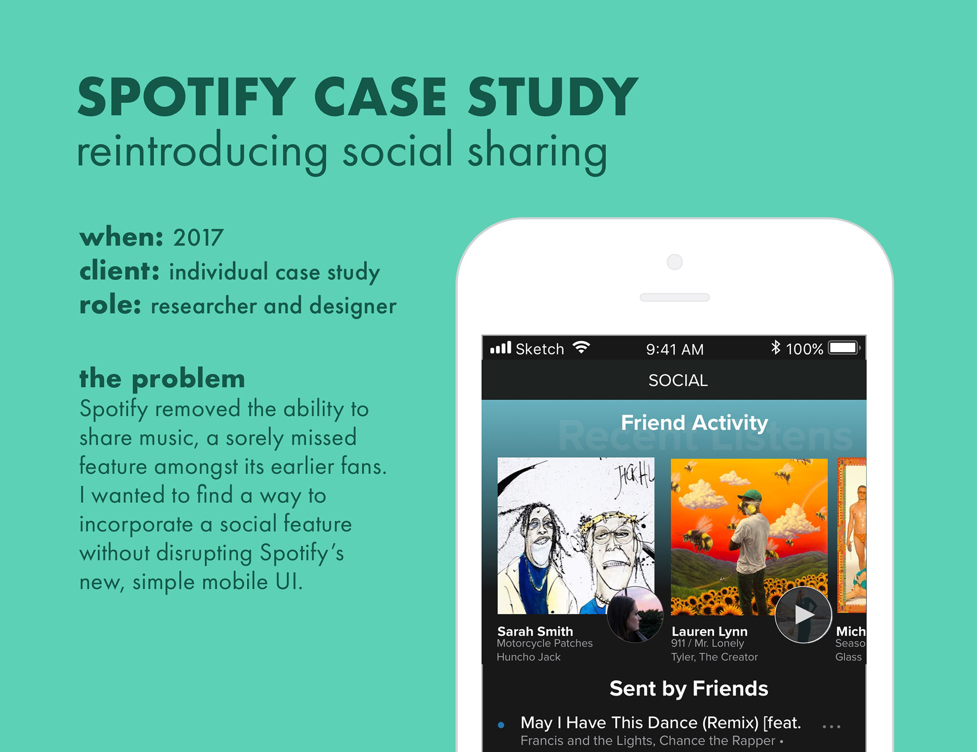
MOTIVATION
While I’m in love with all the features Spotify has to offer, I feel that there is a disconnect between its mobile and desktop application. Disclaimer: much of this redesign is based on my and my friends' opinions: a real redesign would need much more user feedback.
INITIAL THOUGHTS
As I’ve used Spotify many times, I’ve become a little biased to how the application functions. Still, that makes me appreciative of how far the application design has come from its earlier days. The design relies on upward swipes and a carousel gallery on many of its pages. In addition, the navigation bar is at the bottom (close to the thumb and easy to access). The overall impression is very clean, but might be overwhelming if you’ve never used Spotify before.
I wanted to see if it would be possible to build in social integration — seeing what your friends are listening to, which is available on desktop, and being able to internally share music, a feature they once had but since gotten rid of.
Focus: Social Integration
Spotfiy used to allow for internal song sharing on its mobile and desktop applications, allowing users to send and receive songs via Spotify. This was really convenient because it didn’t require circumnavigation via other applications. However, the design and function were flawed, as songs often didn’t show up, and there was no way to delete messages later.
User Feedback
When Spotify got rid of the feature, users felt the loss. I asked a couple of friends for their opinion and got responses like:
“The new application makes more sense, but I’d love to send songs again.”
“I literally never share using external applications.”
“I use collab playlists now but it’s kind of annoying.”
I wanted to re-build in the feature, keeping the integrity of Spotify’s redesign. This was a challenge on multiple levels.
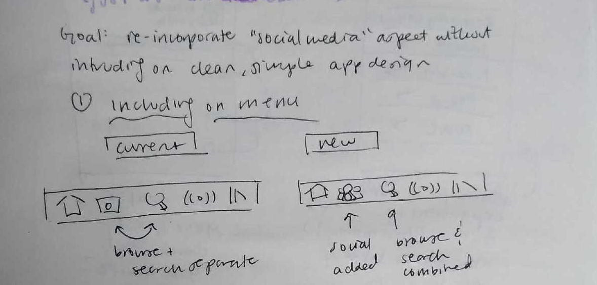
Finding a Place for Social Integration
Before the redesign, it was difficult to find important points of interest in the mobile app. I wanted to keep the integrity of the new, straight-forward design, but also feature the Social tab prominently.
One thing I noticed when using the application is the very ostentatious Search tab. The Search bar preoccupies the top of the tab, and the rest of the tab is populated with your previous searches. Compared to other feature-packed tabs, the Search tab is underwhelming.

The current design has Browse and Search separate, with previous Search history clogging up the entire Search tab. Also, excuse the “christmas trap” search.
Other applications (ex. Instagram) have resolved this issue with the Search bar functioning as a drop-down menu, which then brings up Suggested or Recent searches. The rest of the Search tab real-estate is dedicated to new content, like Instagram’s Discover. I proposed merging Spotify’s Browse and Search pages to free up space for a Social tab, without removing any essential functions or simplicity from the application.

Brainstorming placement of Social tab
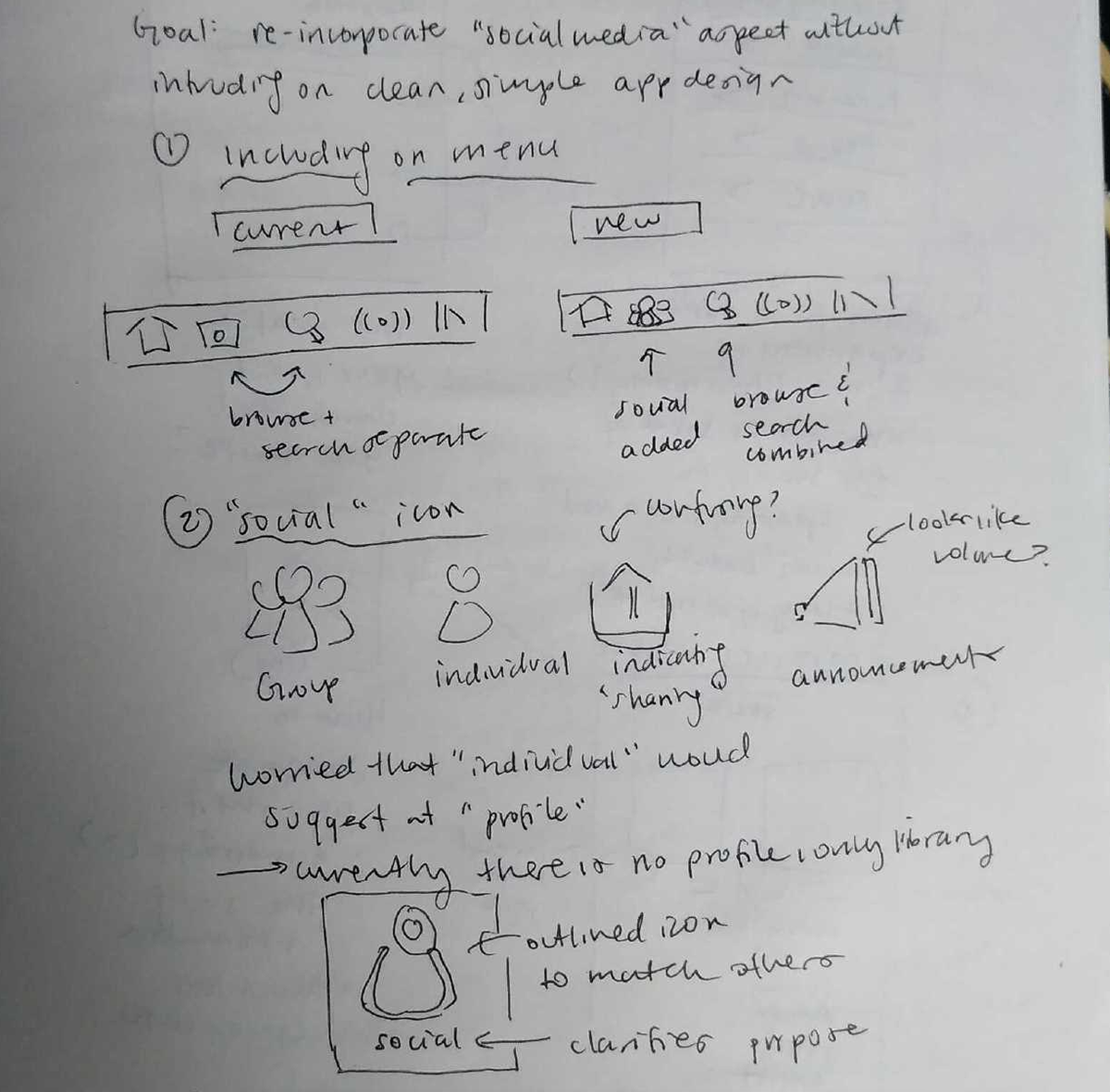
Designing “Social” Icon
I am an enormous fan of Spotify’s simple icons, off-white on off-black outlines. I brainstormed through a few iterations of a “Social” icon before deciding upon a simple outline of a person, in the style of Spotify’s icons. I worried that the person might suggest “Profile,” but since “Your Library” already exists in the rightmost spot (usually dedicated for profiles), I thought the single person icon would suffice to suggest “Social.”
Brainstorming for the design of the Social icon.
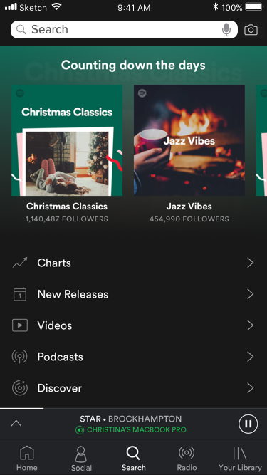
Merge of Browse + Search with the addition of the “Social” icon: I bumped down the pre-existing content for Browse and added a Search bar. Tapping the Search bar would bring up the old page for Search, with all recent search history.
Social Integration: What to Include
It would be hard to include all of the Spotify desktop features on mobile, but one main feature, mentioned earlier, is noticeably missing: the ability to see what your friends are listening to / have listened to recently. In addition, both Spotify mobile and desktop lack the ability to share music.
Problems Encountered
Brainstorming through problems: how to format an “inbox,” how to display friends’ activity, etc.
Which information to include
One issue with mobile design is that font should be large and readable, which results in loss of some features. On the desktop app, you are able to see the following information from the right sidebar:
• Name of friend + profile icon
• Song, artist, playlist/album
• Listening to / time last active
Of course, you are also able to interact with all of this information. Clicking on their name brings up their profile, the song brings up the album, etc. Incorporating all of this directly from the Social page would be difficult.
I decided to model it like the Browse page, with a carousel on top displaying friends and their music. I removed the ability to look at playlists and most recent time active, because I feel that those are less relevant (as compared to which songs they’re listening to). Clicking an item in the carousel brings up the song, just as it normally displays in the app.
How to incorporate an “inbox” with music
Spotify’s old format was a clunky inbox that would sometimes, sometimes not update. It was also its own thing, separate from other features in the application.
I decided to model the new song-sharing like Spotify’s current collaborative playlists: a list of songs with an option to view more information, as indicated by a traditional • • • icon. This way, new music could easily enter and be played, and extra information (who sent it, the message accompanying it, etc.). Spotify heavily uses the • • • motif already to store extra information away from main pages, so users have the option of interacting with the song or not.
In addition, I placed a blue dot as indication of new additions to the inbox, so users would be aware when they received a new song. This is exactly what Spotify does with new additions to podcasts, so I thought the design was rather intuitive.
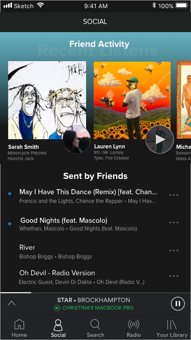
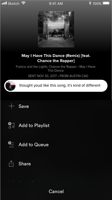
Left: Proposed “Social” page, with a carousel on top to explore what friends are listening to, and a collaborative inbox on bottom that indicates new additions. Right: Pop-up menu that displays upon clicking • • • to show additional information about the song addition, including full details on the song, when it was sent, who it was sent by, and an optional short message. In addition, the user has the ability to interact with the song as usual, adding to playlists, etc.
Conclusion
I strongly think Spotify has the potential to properly reincorporate a social aspect into its mobile application. Song and music sharing is intimate, and Spotify would stand to benefit from exploring options to its previous features. The result would hopefully be a stronger-knit community and more interaction on the app itself, as well as increased loyalty to the service (I originally kept Spotify Premium over alternatives so I could send friends music.)
My Takeaways
Whew! What I imagined as a relatively simple project was not at all. Here are some things I took away from this experiment:
• Mobile design is not like web or desktop design. When I streamed the results to my phone, I was shocked at how small the texts were, and how specific my interactions had to be. Spotify currently excels because it doesn’t have miss-able, hard-to-tap interactions.
• Minimalism is hard to maintain when building in new features. It was really hard for me to decide what to strip for the sake of larger font and a less jumbled screen. For example, some people might find it critical to know who sent them songs from the mainpage, as opposed to clicking on an external page.
• I really enjoyed doing this! It was awesome to be able to toy around and see if something that I’ve dreamed of for so long, was possible in practice. This was my first practice with Sketch, and I’m looking forward to playing around with it more (maybe even building a complete interactive version!)
The iPhone mockups are courtesy of Taylor Hu from MagicMirror. All mockups were created on Sketch.