The Thresher has a notorious Backpage, which uses satire to bite at relevant campus events and drama. This often results in semi-ridiculous designs that best showcase the joke. Out of everything in the paper, the Backpage is the most creatively challenging and has pushed me to stretch my design skills. Below are a few examples of my interpretations of Backpage jokes.
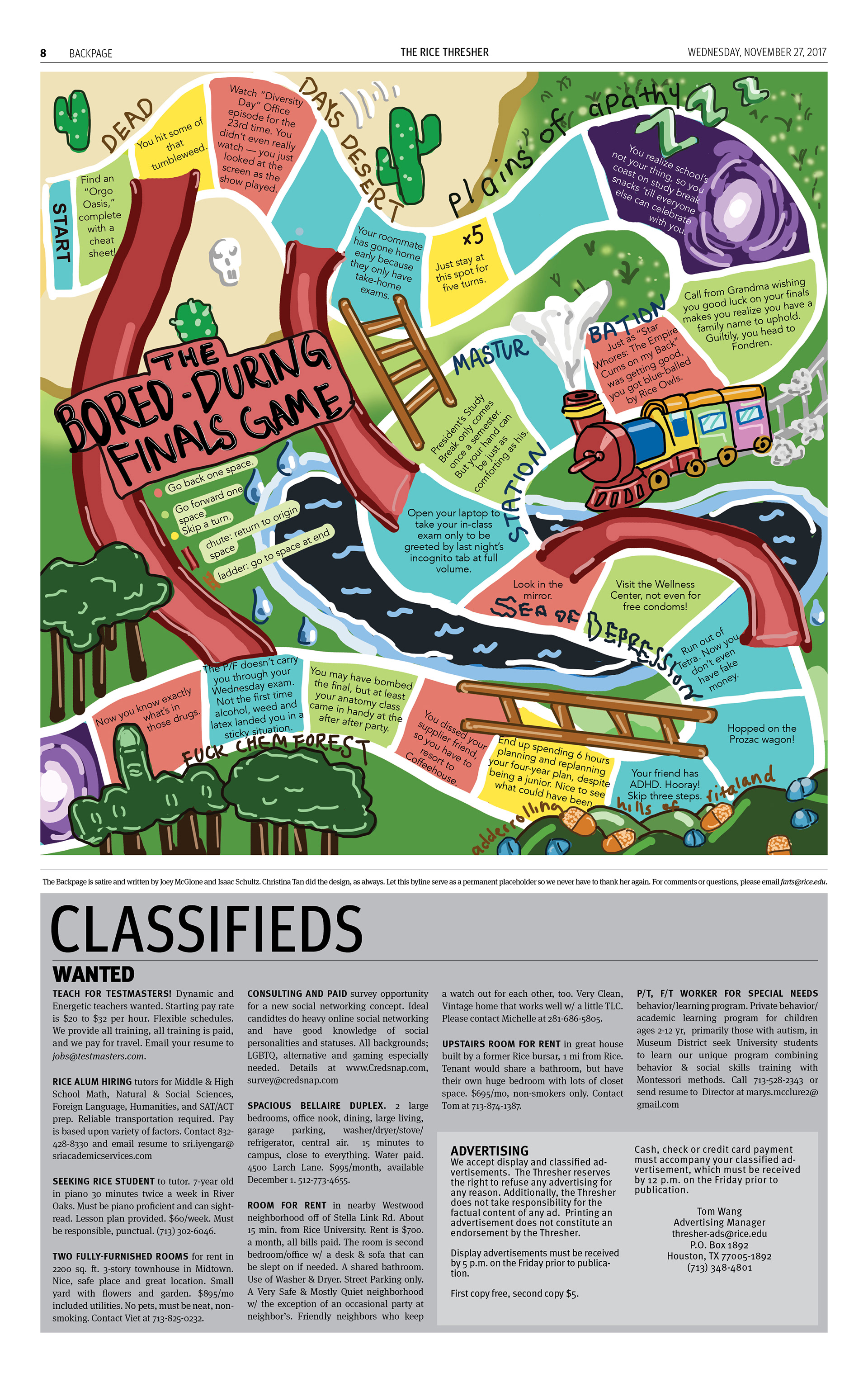
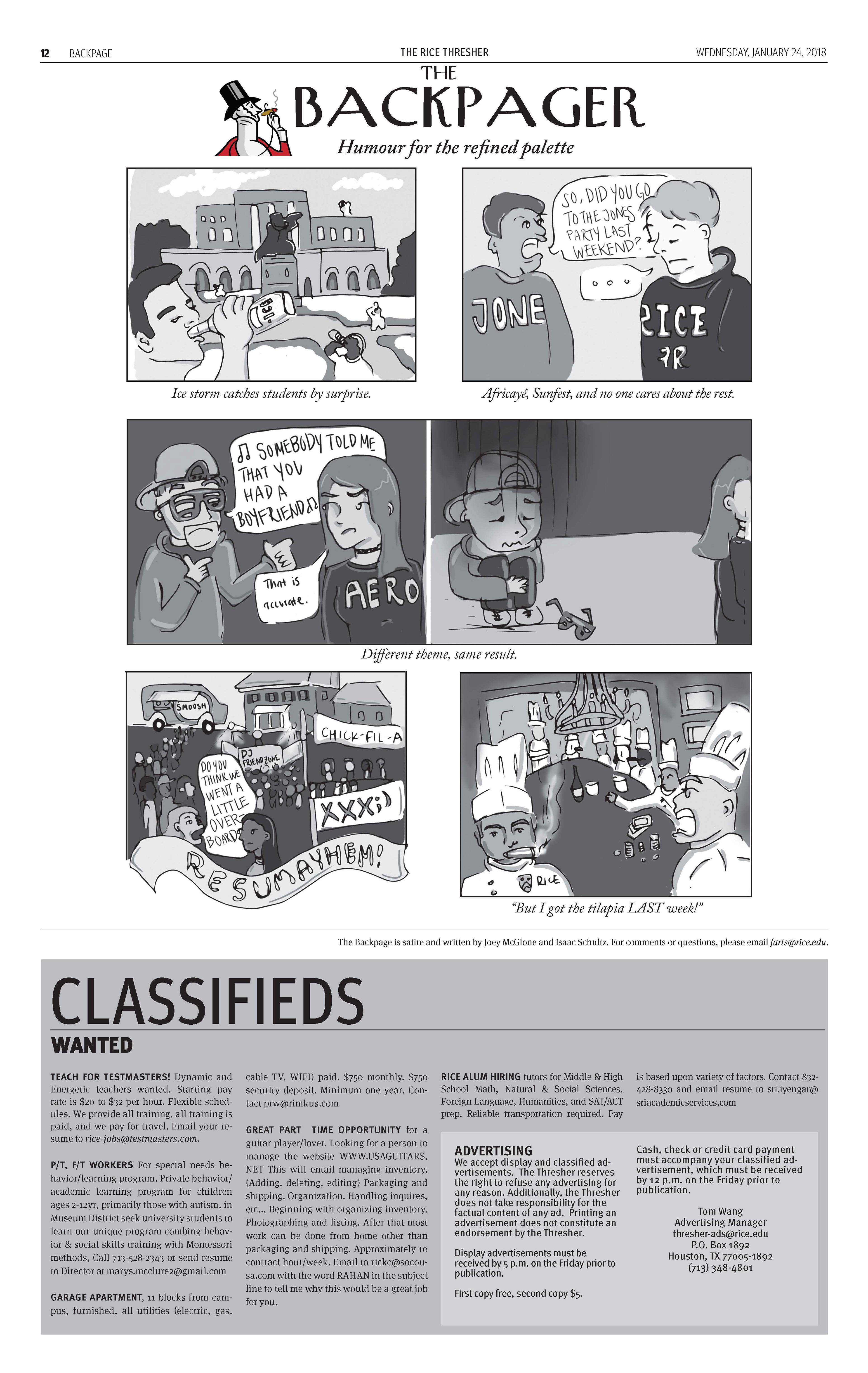
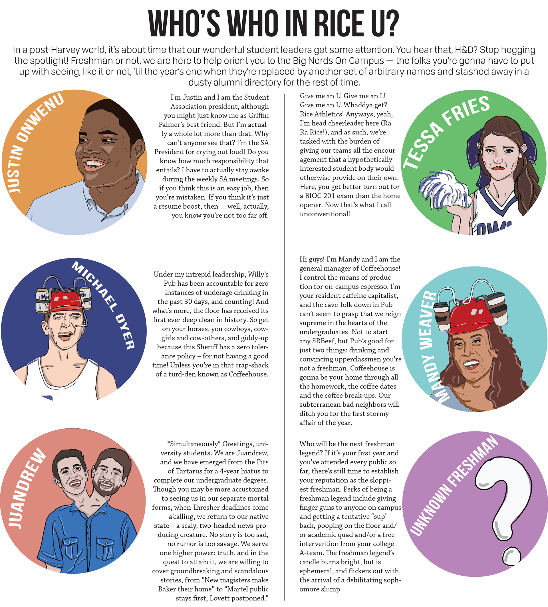
Illustration-heavy – Some backpages required elaborate drawing to execute the jokes – the New Yorker page in particular. I utilized a Wacom tablet to make all of the illustrations from scratch.
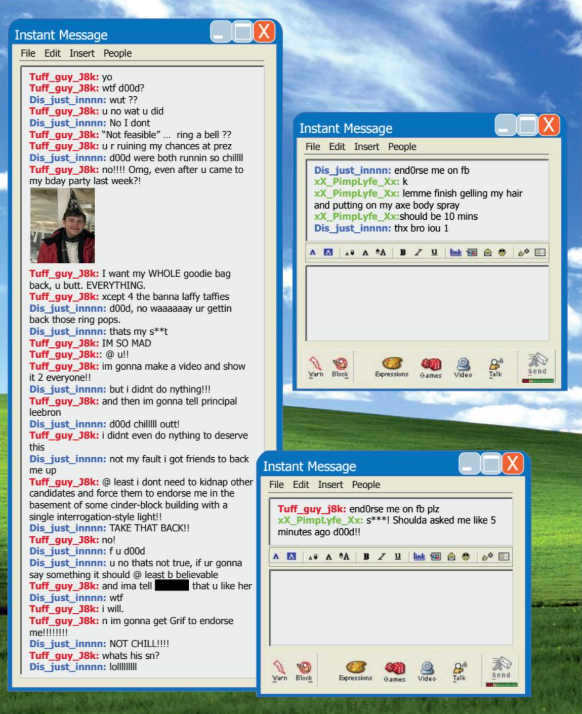
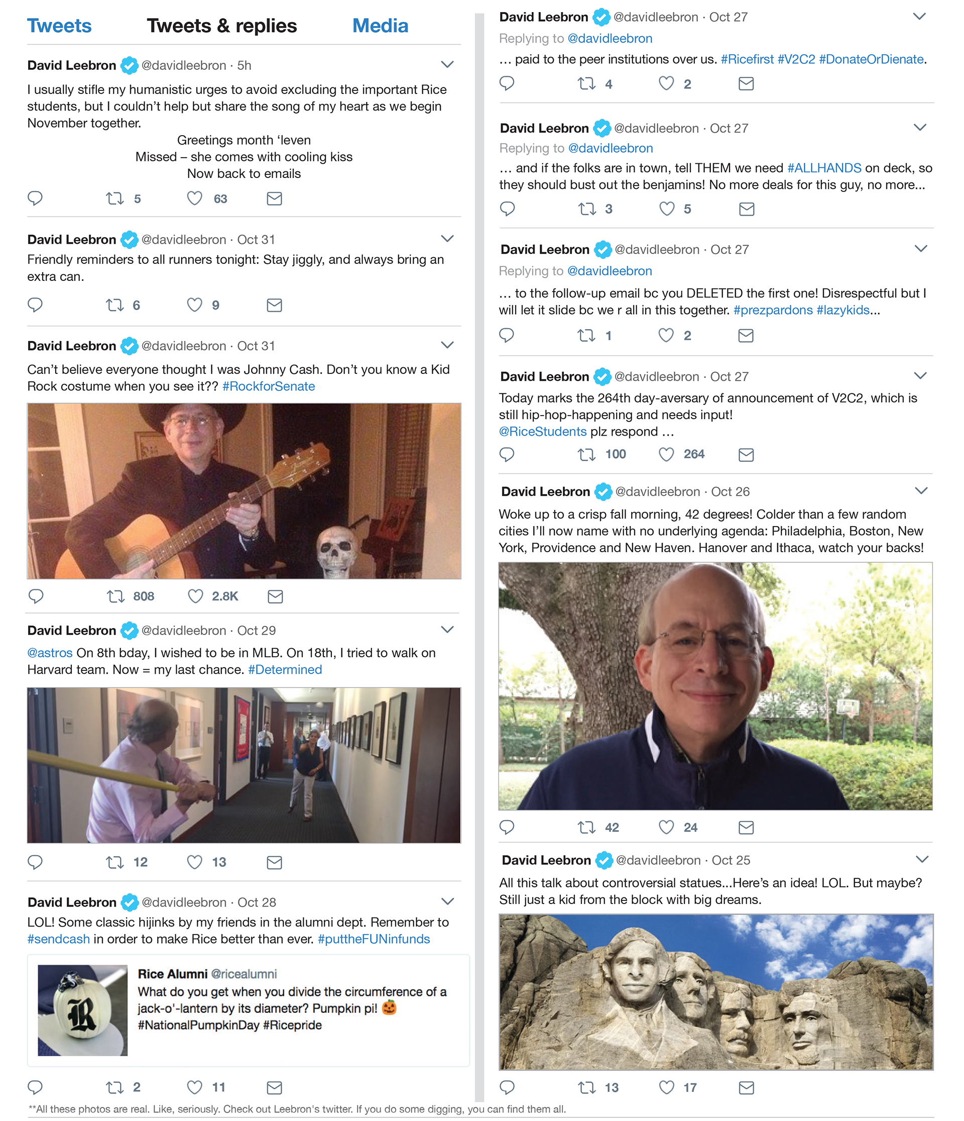
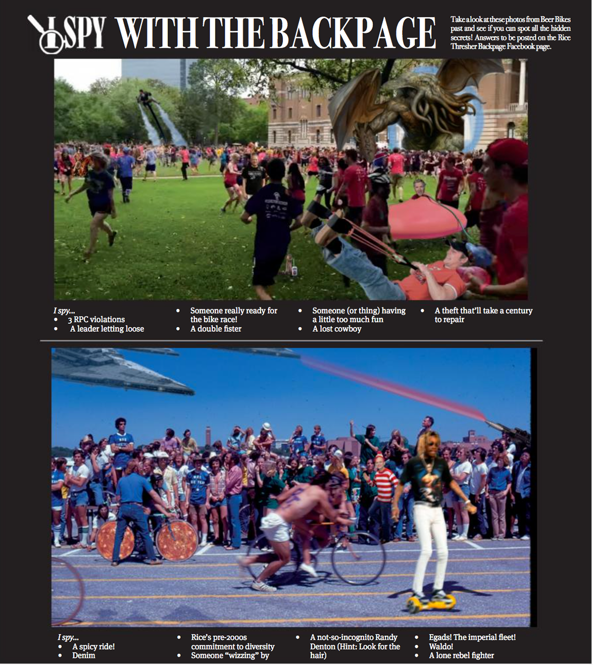
Photoshop-heavy – I was often tasked with mimicking an existing interface or format. The Beer Bike issue had me photoshopping 10+ items into each photo – ranging from Cthulu to Wiz Khalifa on a hoverboard.

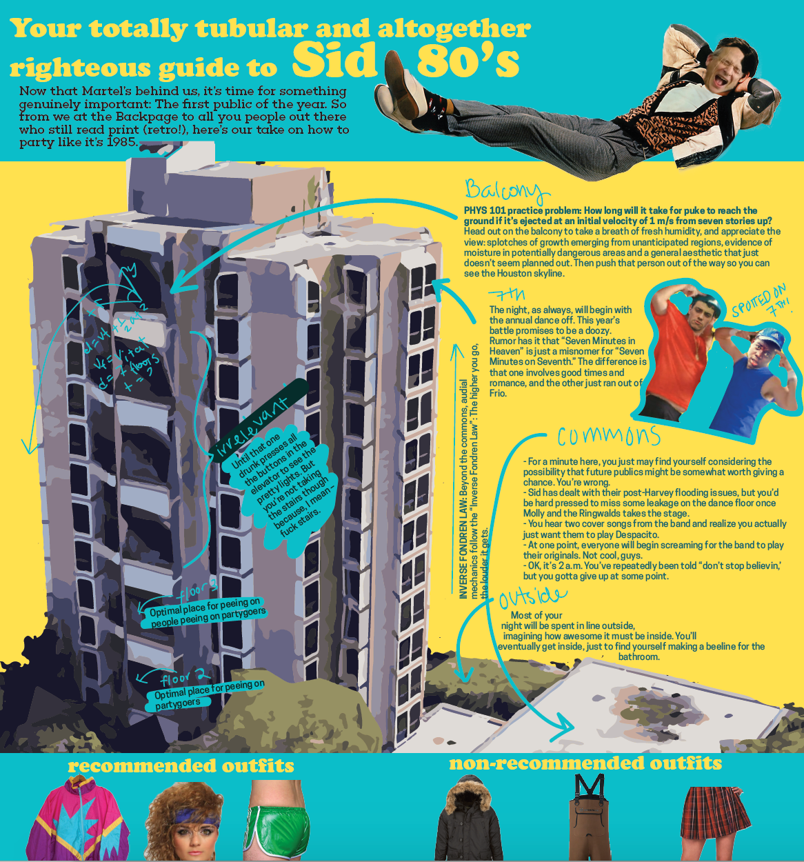

Unique formats – I was given free rein to design backpages as I saw fit, matching the theme of the jokes. This was particularly successful in the above examples – especially when navigating large bodies of text.