Motivation
In summer 2018, I interned with a biotechnology startup, Rebion. Rebion has done amazing work in improving early diagnosis of lazy eye – a critical development in the world of pediatric ophthalmology. In an effort to increase awareness of pediatric ophthalmology, Rebion also developed an application called BabySee. BabySee allows parents to see how their children do as they develop.
Initial Thoughts
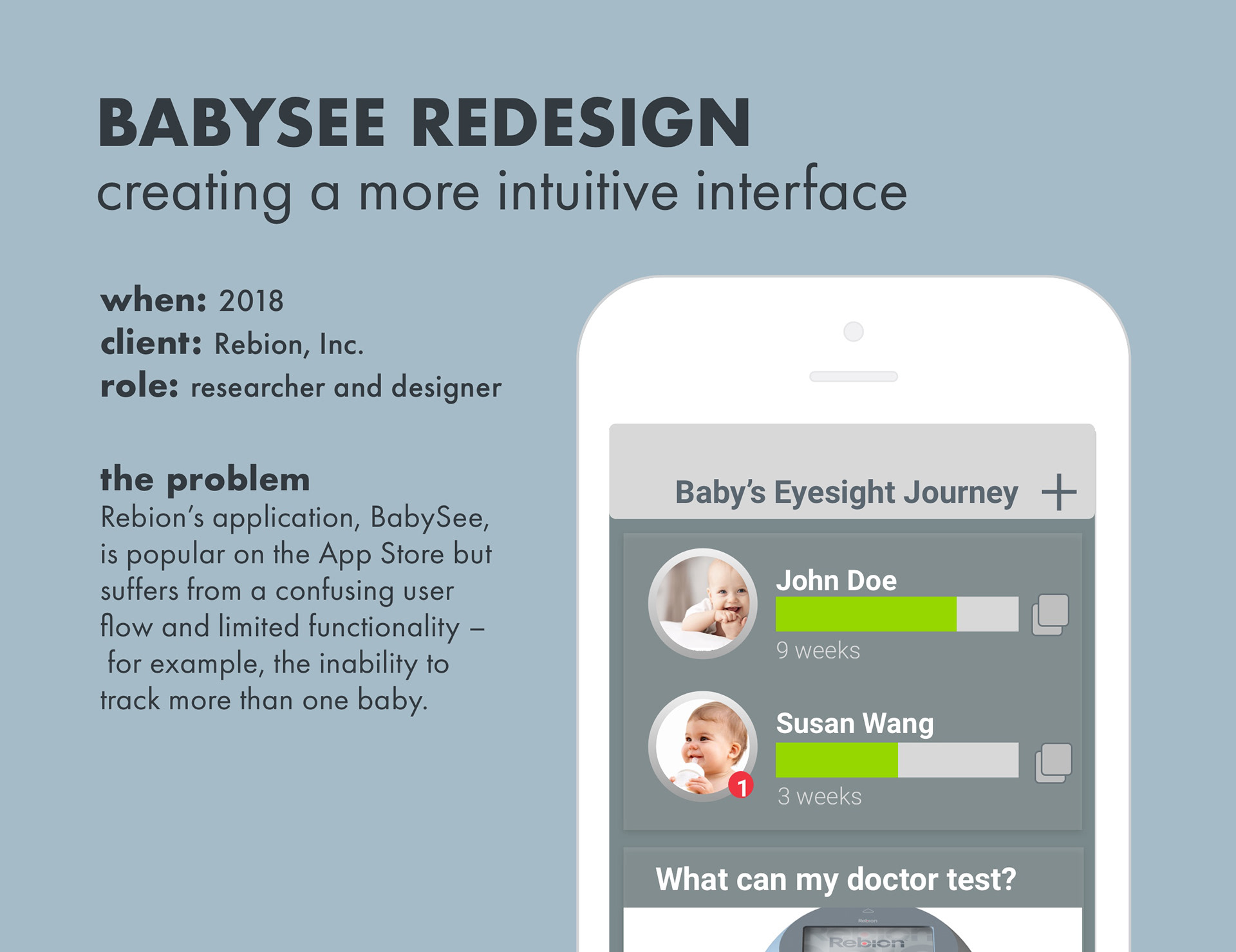
Although BabySee was quite popular (50,000+ downloads), many reviews complained about the lack of functionality – users could only track one baby at a time. I decided to look into that as a focus point. While researching that, however, I noticed that the flow of the application from start screen to action was very non-intuitive. This became my second focus.
Focus: User Flow
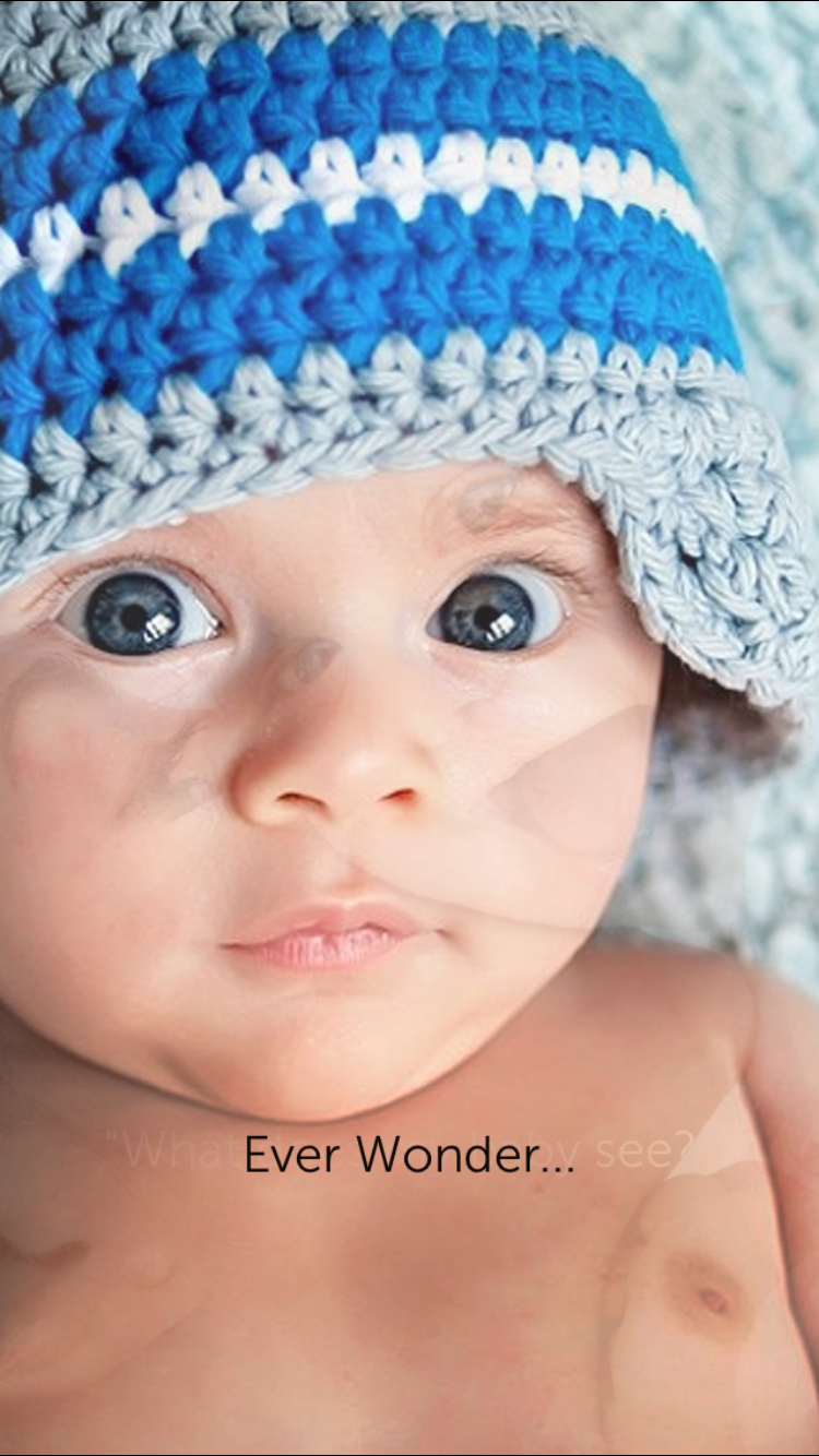
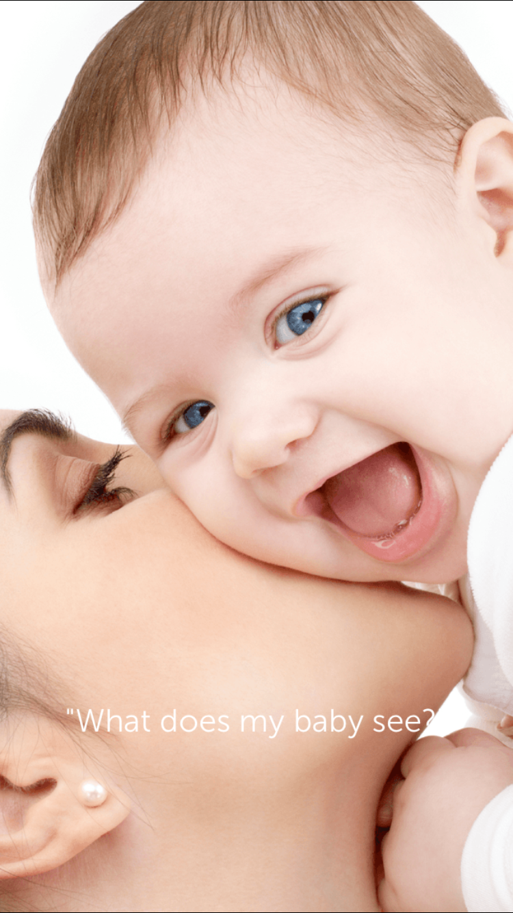
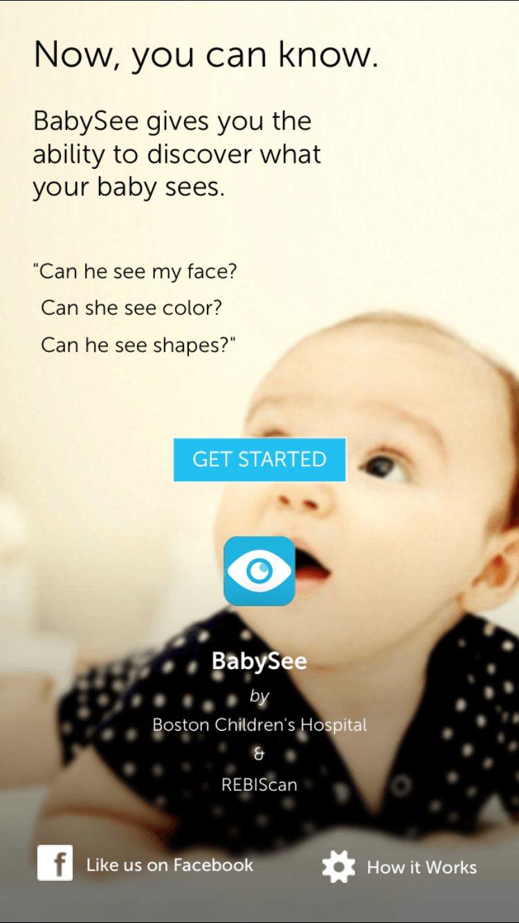
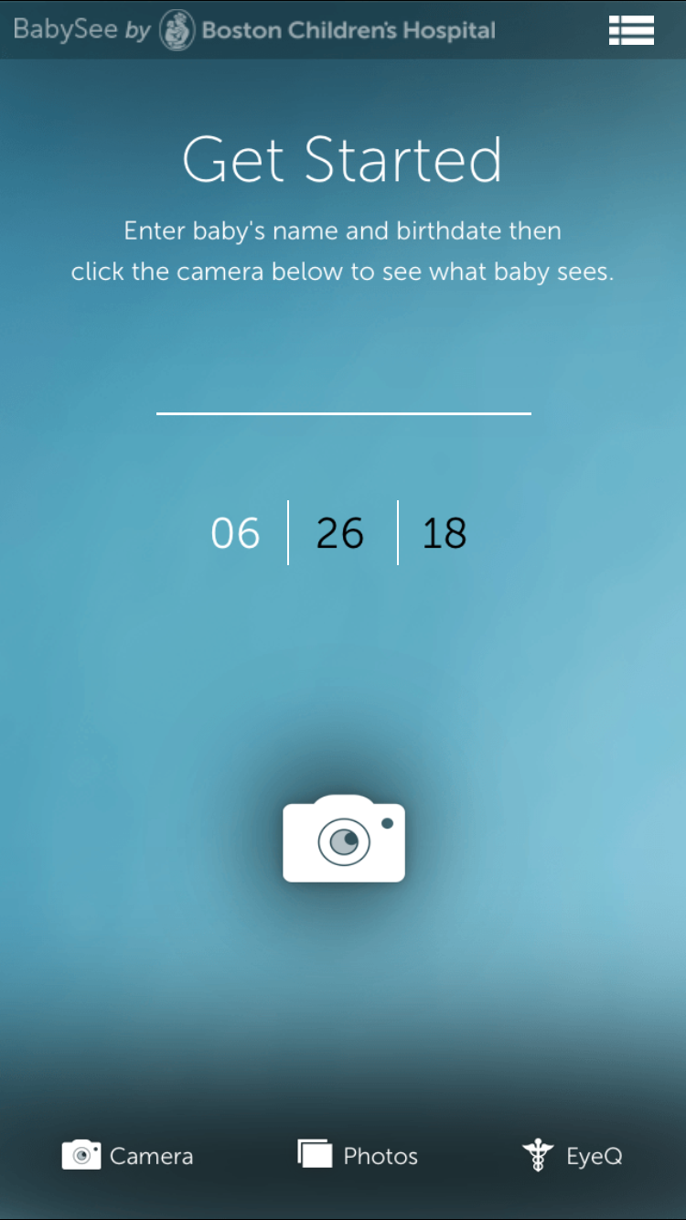
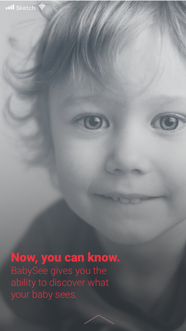
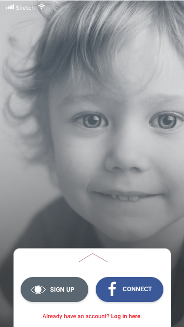
The flow of the application starts with a sequence of photos before a "Get Started" page. This entire flow is inaccessible after opening the application once. The final screen allows for inputting of one name, but no more, and is the screen that appears after the application is opened once. Lastly, more information can be found under "EyeQ."
Creating a Log-in
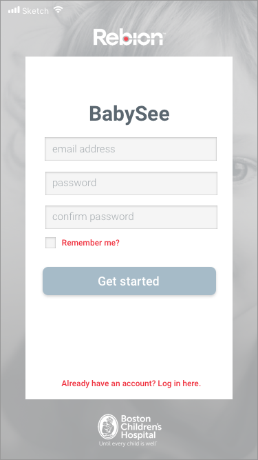
One issue prevails with the above design: the inability to access the start sequence again, and also the floating nature of the data. Data is not attached to an account, and users have no way of retrieving their data should they lose their phone, etc.
I decided to follow the rule of most modern applications – connecting with Facebook or e-mail. This removes a lot of the burden of work off of the user. Instead of creating a unique log-in for themselves, they can simply use an existing account.


Thought process of log-in sequence and rough prototype of home-screen, incorporating the ability to track multiple children as well as developing a more intuitive navigation bar that follows users' conceptual models.
Final log-in sequence. The first screen offers some of the same appeal as the original log-in screen, but simplified and less obtrusive. Log-in can be done using Facebook or through a very simple email sign-up.
Adding Functionality
Now that the initial user flow was less confusing, I had the space to develop in more functionality. Following user conceptual models about logging in and accessing data, I decided to place the home screen directly after log in. From the home screen, users could access the camera, former photos, or more information – all in a more intuitive and obvious navigation bar. For example, the camera icon was moved from the center of the screen to the bottom center of the bar, as is common amongst photo applications

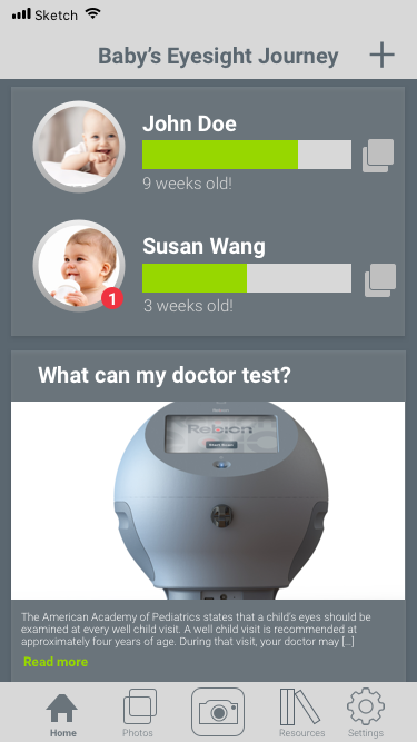
Side by side comparison of the home pages. Notice the embedded capability of managing multiple children and their files from the new home page.
Increasing Rebion visibility
An added perk of the new design was a greater visibility of resources – in particular, the ones that Rebion has to offer. I incorporated this subtle advertising into the homepage in the form of "What can my doctor test?" Parents who are curious enough to download BabySee may also be curious to know what next steps might look like.
Conclusion
The BabySee application has enormous space for improvement – its popularity indicates that applications regarding infant health have potential in the App Store. Being able to develop an initial goal in the context of a broader redesign was really exciting, and encouraged me to do a lot more research into how other applications function. Following users' conceptual models was a great way for me to understand what makes a flow "intuitive!"
Note: The redesign was presented to staff, but has not yet seen implementation.